Discover | Build | Shop
O'KEEFFE'S


OUTCOME
OUTCOME
The "Find My Match" quiz received positive usability feedback, reducing misdirected customers by 38% and enhancing user experience.
Revamping the product list and detail pages fostered trust among new users, resulting in a 12% boost in online sales.
I implemented a SaaS solution using Mailchimp for email marketing, contributing to a 25% increase in customer retention and overall user satisfaction, reflecting the effectiveness of the integrated e-commerce solution and overall user satisfaction.
MY ROLE
MY ROLE
Developed personas, journey maps, and user stories.
Created and iterated on low and high-fidelity wireframes.
Conducted usability tests to validate design effectiveness in the market.
Developed personas, journey maps, and user stories.
Created and iterated on low and high-fidelity wireframes.
Conducted usability tests to validate design effectiveness in the market.
Developed personas, journey maps, and user stories.
Created and iterated on low and high-fidelity wireframes.
Conducted usability tests to validate design effectiveness in the market.
User Experience Designer
User Experience Designer
User Experience Designer
Tools
Tools
Tools
Adobe XD
Adobe Creative Suite
Miro
Zoom Meetings
Adobe XD
Adobe Creative Suite
Miro
Zoom Meetings
Adobe XD
Adobe Creative Suite
Miro
Zoom Meetings
User Researcher
User Researcher
User Researcher
Collaborated with Niranjan & Jared for primary research.
I created findability test plans and scripts and conducted semi-structured interviews during the evaluation of the existing website
Collaborated with Niranjan & Jared for primary research.
I created findability test plans and scripts and conducted semi-structured interviews during the evaluation of the existing website
Collaborated with Niranjan & Jared for primary research.
I created findability test plans and scripts and conducted semi-structured interviews during the evaluation of the existing website
Timeline
Timeline
Timeline
4 Months
4 Months
4 Months
THE CHALLENGE
THE CHALLENGE
THE CHALLENGE
ENHANCE O'KEEFFE'S ONLINE SHOPPING EXPERIENCE
ENHANCE O'KEEFFE'S ONLINE SHOPPING EXPERIENCE
ENHANCE O'KEEFFE'S ONLINE SHOPPING EXPERIENCE
While navigating O'Keeffe's website, I noticed users had to visit third-party sites to make purchases, wasting time and causing frustration. I aimed to resolve this by directly integrating a seamless e-commerce platform into the site.
The primary goals were to:
1. Gain the trust of new users
2. Product awareness
SOLUTION: REDESIGNING SHOPPING EXPERIENCE
SOLUTION: REDESIGNING SHOPPING EXPERIENCE
SOLUTION: REDESIGNING SHOPPING EXPERIENCE
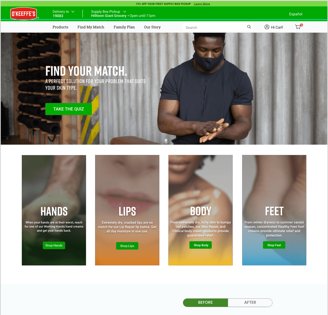
FIND MY MATCH
FIND MY MATCH
FIND MY MATCH
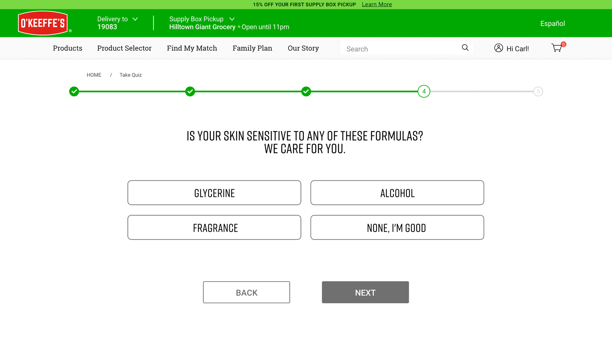
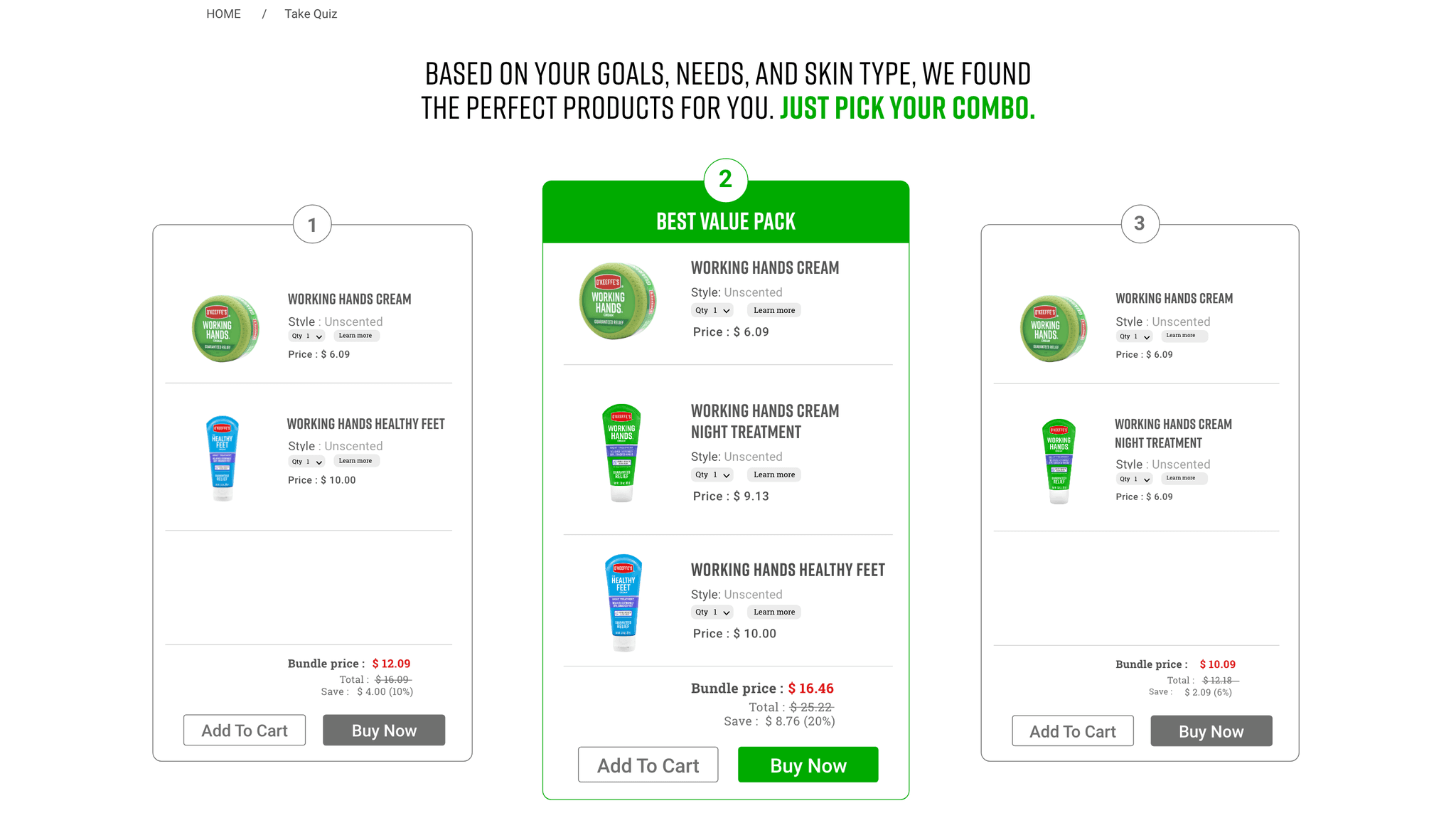
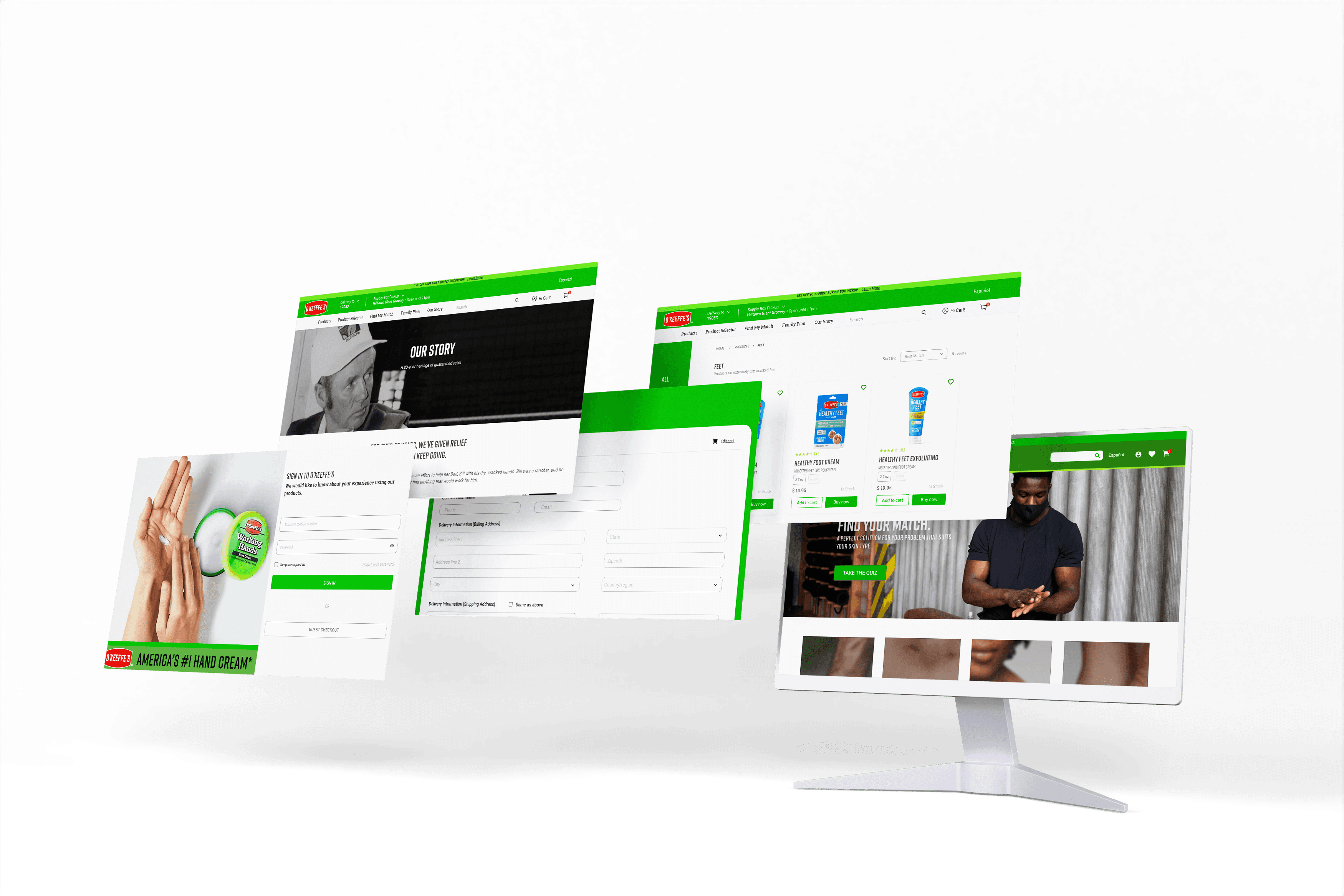
In a fast-paced world, O'Keeffe's simplifies your shopping with a swift, smooth, and hassle-free experience. It recommends products tailored to your needs and offers custom bundles at checkout, ensuring excellent value.
In a fast-paced world, O'Keeffe's simplifies your shopping with a swift, smooth, and hassle-free experience. It recommends products tailored to your needs and offers custom bundles at checkout, ensuring excellent value.
Redesigned shopping experience at O'Keeffe's
Redesigned shopping experience at O'Keeffe's
Redesigned shopping experience at O'Keeffe's

SAAS SOLUTION
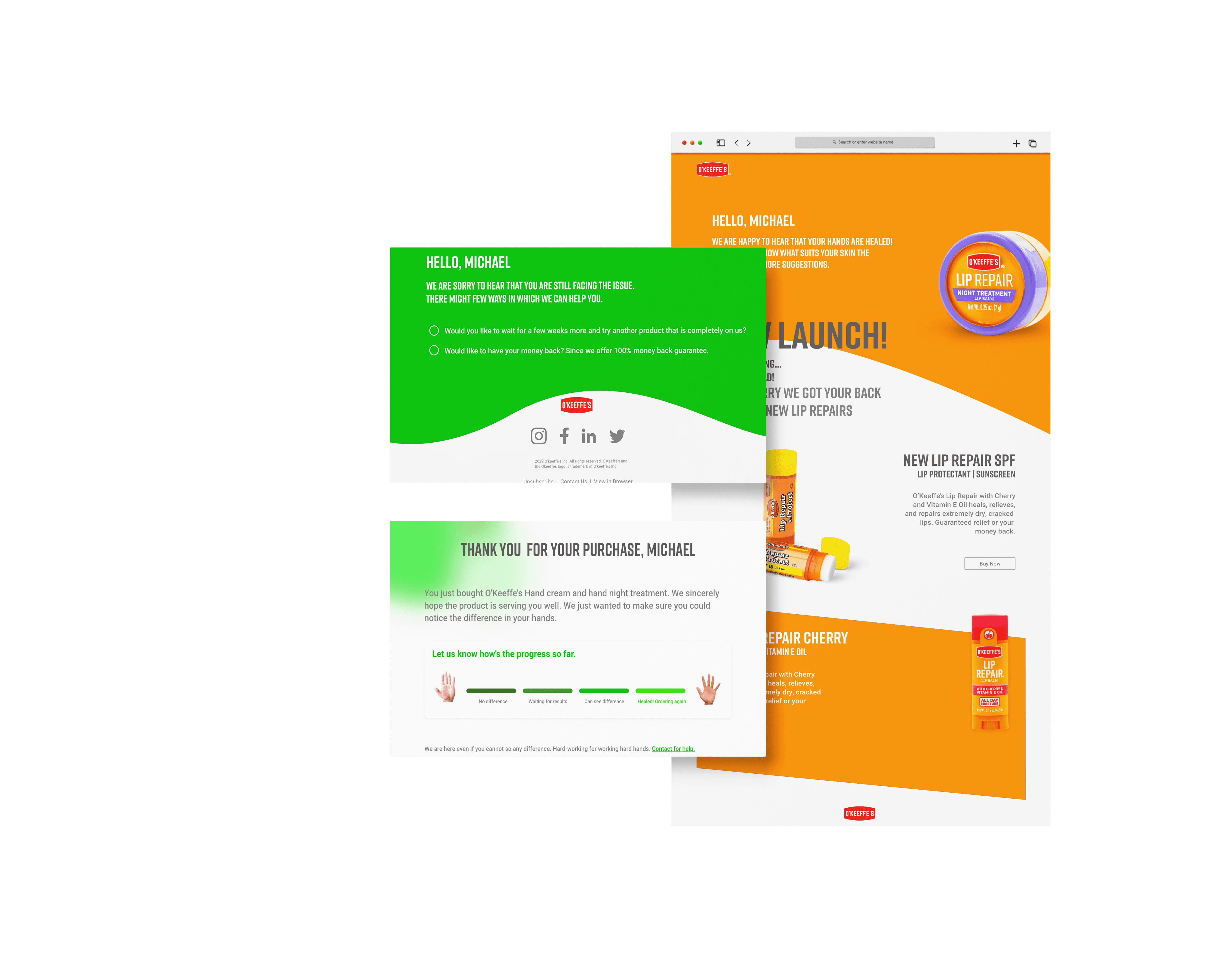
Following Mailchimp guidelines, automated marketing emails were generated and sent to gather user feedback. Based on this feedback, personalized emails were sent, enhancing client retention through a targeted SaaS solution.
SAAS SOLUTION
Following Mailchimp guidelines, automated marketing emails were generated and sent to gather user feedback. Based on this feedback, personalized emails were sent, enhancing client retention through a targeted SaaS solution.
PRIMARY RESEARCH KICK OFF
PIECING IT BACK TOGETHER
Initially, at the start of the project, I did not have any clear mission or set goals for the online shopping experience. I collaborated with Niranjan and conducted a Baymard UX audit, where O'Keeffe's existing website was compared with data collected by Baymard Institute from various companies, across 500+ UX parameters. User testing was performed on O'Keeffe's existing website with 6 participants, each given 4 tasks. Following this, we conducted user interviews to collect feedback.
KICK OFF
PIECING IT BACK TOGETHER
Initially, at the start of the project, I did not have any clear mission or set goals for the online shopping experience. I collaborated with Niranjan and conducted a Baymard UX audit, where O'Keeffe's existing website was compared with data collected by Baymard Institute from various companies, across 500+ UX parameters. User testing was performed on O'Keeffe's existing website with 6 participants, each given 4 tasks. Following this, we conducted user interviews to collect feedback.
INITIAL IMPRESSIONS
INITIAL IMPRESSIONS
The findings provided insights into user perceptions and the alignment between their actions and thoughts. Our goal was to understand the challenges new online buyers of O'Keeffe's faced.
The findings provided insights into user perceptions and the alignment between their actions and thoughts. Our goal was to understand the challenges new online buyers of O'Keeffe's faced.
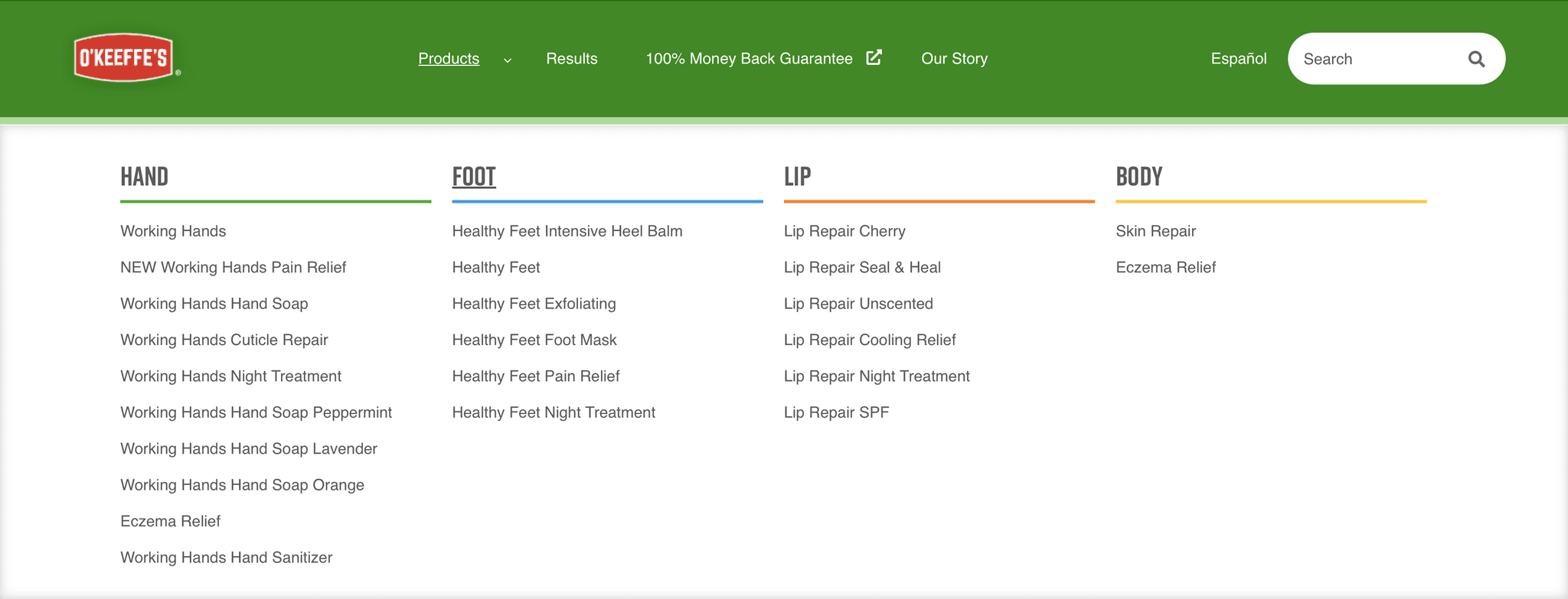
Product name similarity confused new users
Product name similarity confused new users
Product name similarity confused new users
Product name similarity confused new users
First-time users were confused and took a lot of time when asked to find a specific product from the navigation bar due to similar initial names.
First-time users were confused and took a lot of time when asked to find a specific product from the navigation bar due to similar initial names.
First-time users were confused and took a lot of time when asked to find a specific product from the navigation bar due to similar initial names.
First-time users were confused and took a lot of time when asked to find a specific product from the navigation bar due to similar initial names.

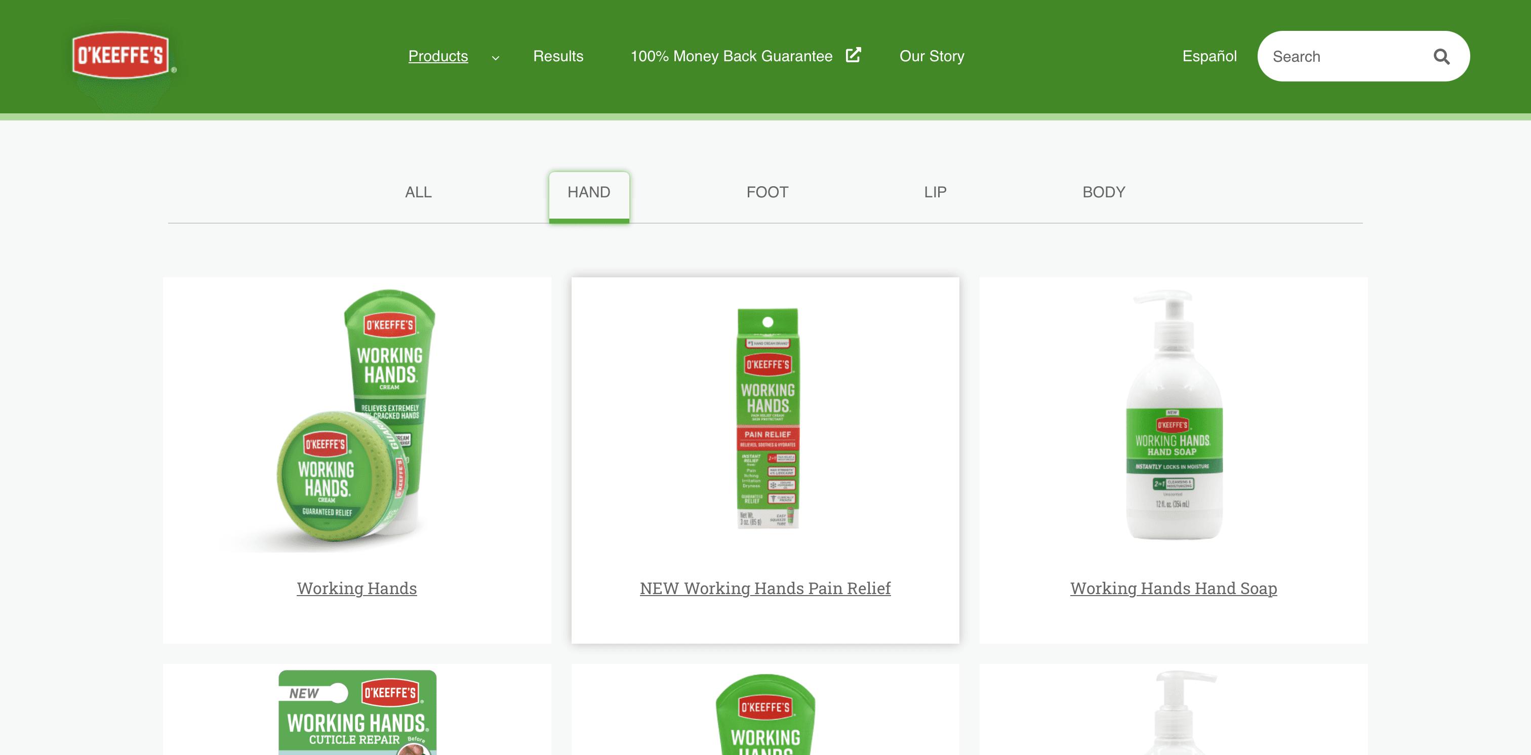
Inadequate product details on the listing page undermined user trust
Inadequate product details on the listing page undermined user trust
Product listing lacks crucial details: price, ratings, and product purpose. Only pictures and names of the products are not convincing enough to new customers.
Product listing lacks crucial details: price, ratings, and product purpose. Only pictures and names of the products are not convincing enough to new customers.
Product listing lacks crucial details: price, ratings, and product purpose. Only pictures and names of the products are not convincing enough to new customers.
Product listing lacks crucial details: price, ratings, and product purpose. Only pictures and names of the products are not convincing enough to new customers.

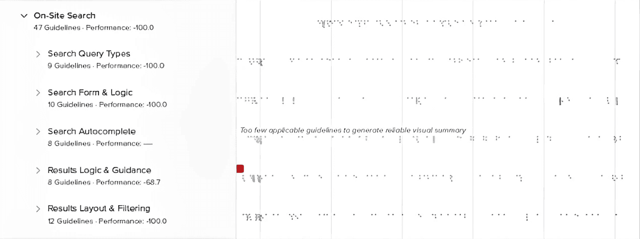
The scoped on-site search engine was frustrating new users
The scoped on-site search engine was frustrating new users
Scoped search aims to simplify user searches but confuses new users with premature decisions, causing cognitive strain. Ambiguous labels and vague autocomplete groups exacerbate the problem.
Scoped search aims to simplify user searches but confuses new users with premature decisions, causing cognitive strain. Ambiguous labels and vague autocomplete groups exacerbate the problem.
Scoped search aims to simplify user searches but confuses new users with premature decisions, causing cognitive strain. Ambiguous labels and vague autocomplete groups exacerbate the problem.
Scoped search aims to simplify user searches but confuses new users with premature decisions, causing cognitive strain. Ambiguous labels and vague autocomplete groups exacerbate the problem.

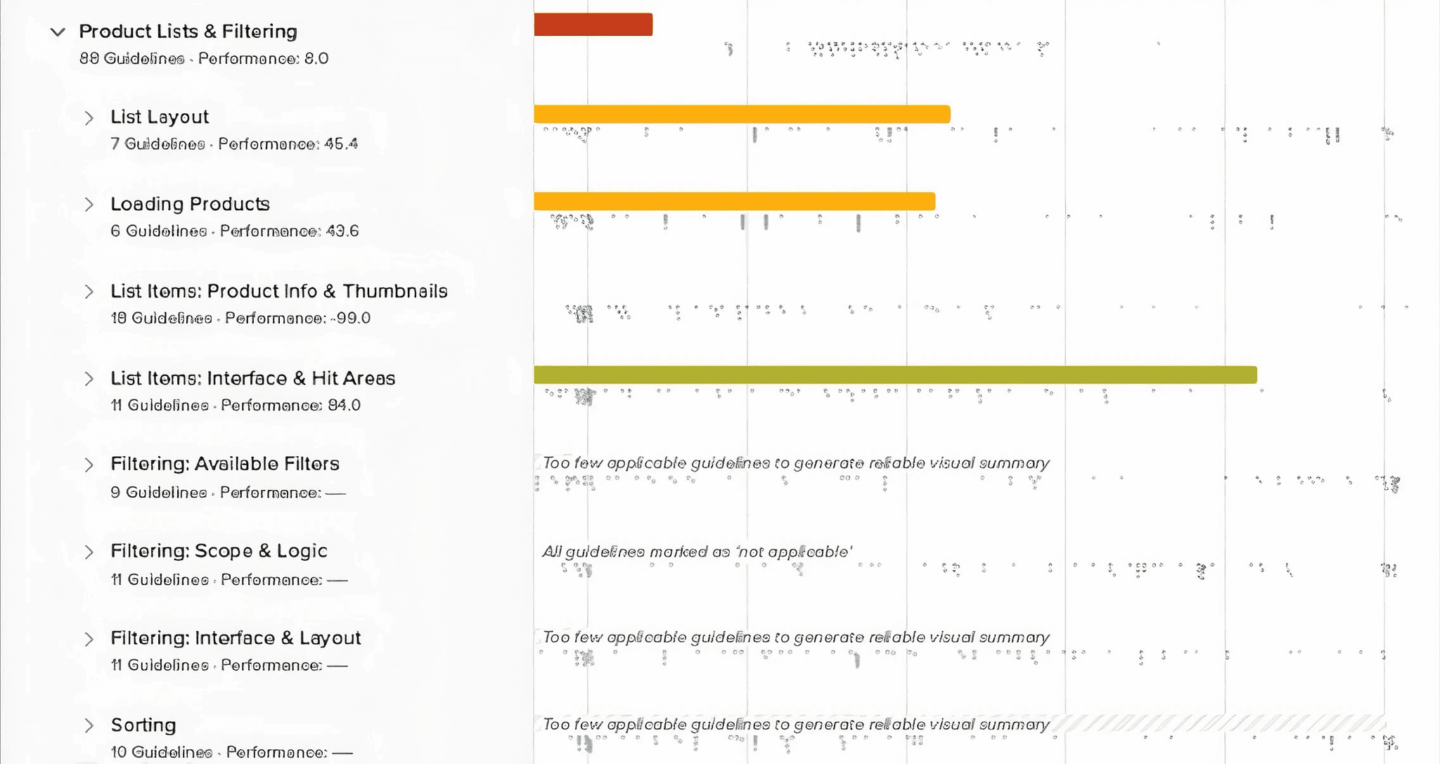
Missing e-commerce features wasted users' time with unnecessary third-party redirects.
Instead of a direct "Buy Now" button, the site featured a "Where to Buy" button. This button led users through a checkout process, only to redirect them to third-party websites for purchase. This indirect path not only created additional steps but also caused frustration and wasted users' time, as they could not complete their purchases efficiently on the original site.
Instead of a direct "Buy Now" button, the site featured a "Where to Buy" button. This button led users through a checkout process, only to redirect them to third-party websites for purchase. This indirect path not only created additional steps but also caused frustration and wasted users' time, as they could not complete their purchases efficiently on the original site.
Instead of a direct "Buy Now" button, the site featured a "Where to Buy" button. This button led users through a checkout process, only to redirect them to third-party websites for purchase. This indirect path not only created additional steps but also caused frustration and wasted users' time, as they could not complete their purchases efficiently on the original site.
Instead of a direct "Buy Now" button, the site featured a "Where to Buy" button. This button led users through a checkout process, only to redirect them to third-party websites for purchase. This indirect path not only created additional steps but also caused frustration and wasted users' time, as they could not complete their purchases efficiently on the original site.
CURRENT USER JOURNEY
DIFFICULTY ACCESSING PRODUCT INFORMATION
The identified issue is twofold: Firstly, new users are burdened with the additional task of visiting external sites to complete purchases after reviewing products on O'Keeffe's website, leading to increased user effort. Secondly, people are extra careful when buying body care products because they worry about skin allergies. The absence of clear product descriptions sometimes made them question their decisions, especially since they have more in-store options.
The identified issue is twofold: Firstly, new users are burdened with the additional task of visiting external sites to complete purchases after reviewing products on O'Keeffe's website, leading to increased user effort. Secondly, people are extra careful when buying body care products because they worry about skin allergies. The absence of clear product descriptions sometimes made them question their decisions, especially since they have more in-store options.
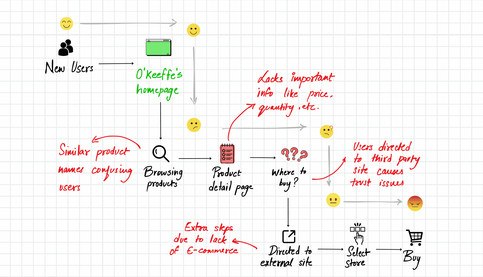
Current online shopping journey at O'Keeffe's website
Current online shopping journey at O'Keeffe's website
REFRAMING THE PROBLEM
REFRAMING THE PROBLEM
This prompted the question: How can we simplify the shopping experience and keep users on the site? My solution was to integrate an e-commerce platform with a feature called "Find My Match," which offers smart product recommendations based on a brief survey to understand user preferences. This allows customers to explore and buy O'Keeffe's products seamlessly in one place.
" …improve the visibility of O'Keeffe's product offerings for new users to boost online sales? "
HOW MIGHT WE…
HOW MIGHT WE…
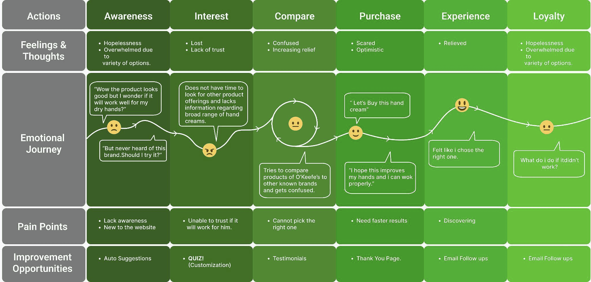
USER JOURNEY MAP
USER JOURNEY MAP
USER JOURNEY MAP
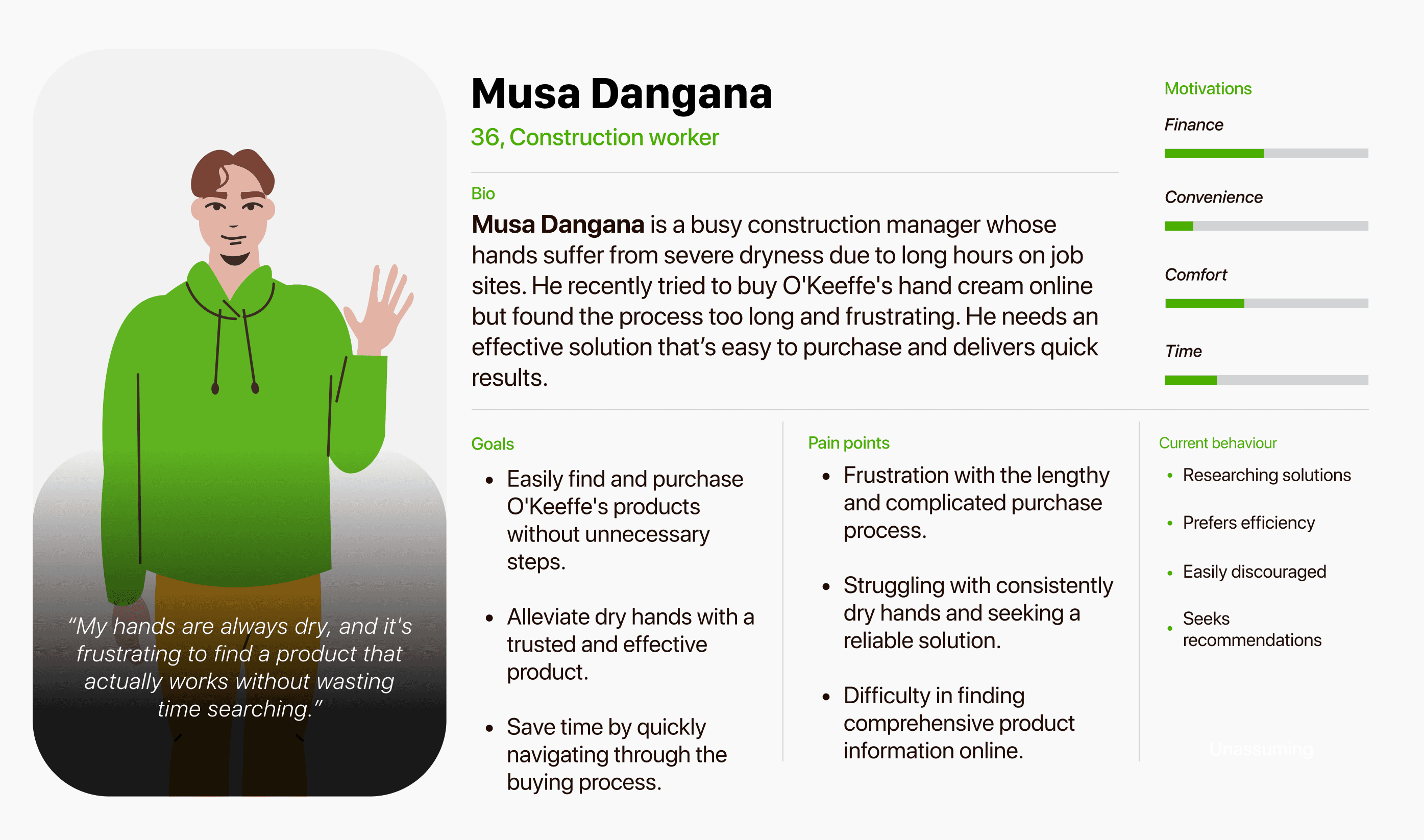


USER PERSONA
USER PERSONA
USER PERSONA
HOW DID WE GET THERE?
HOW DID WE GET THERE?
SITE MAP/THE CROSSOVER
SITE MAP/THE CROSSOVER
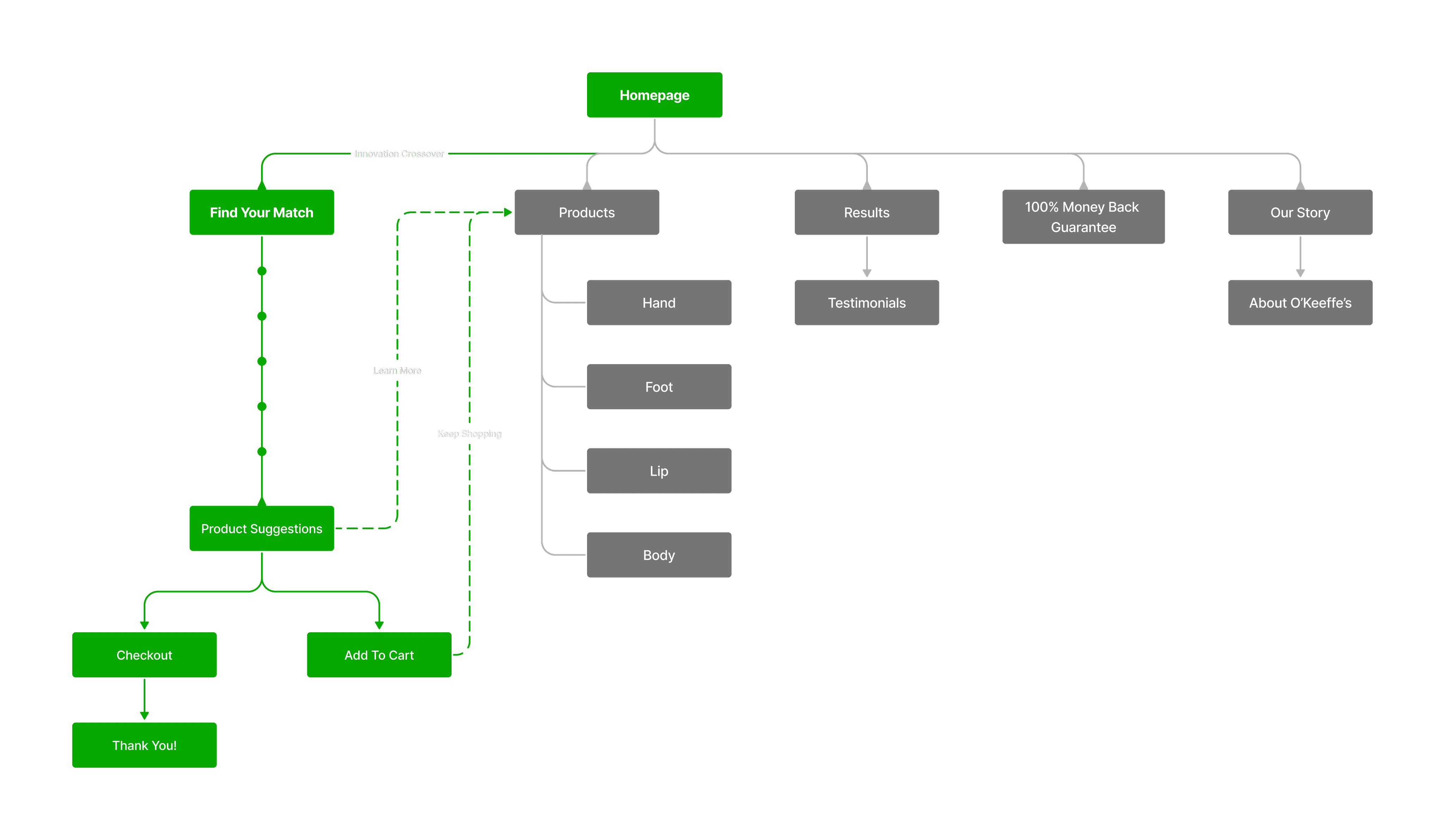
The "Find My Match" feature is prominently on the homepage for easy visibility. Intuitive navigation guides users through simple questions, ensuring a user-friendly experience. The site map highlights its accessibility from various sections, making it effortless for users to find and use the tool.


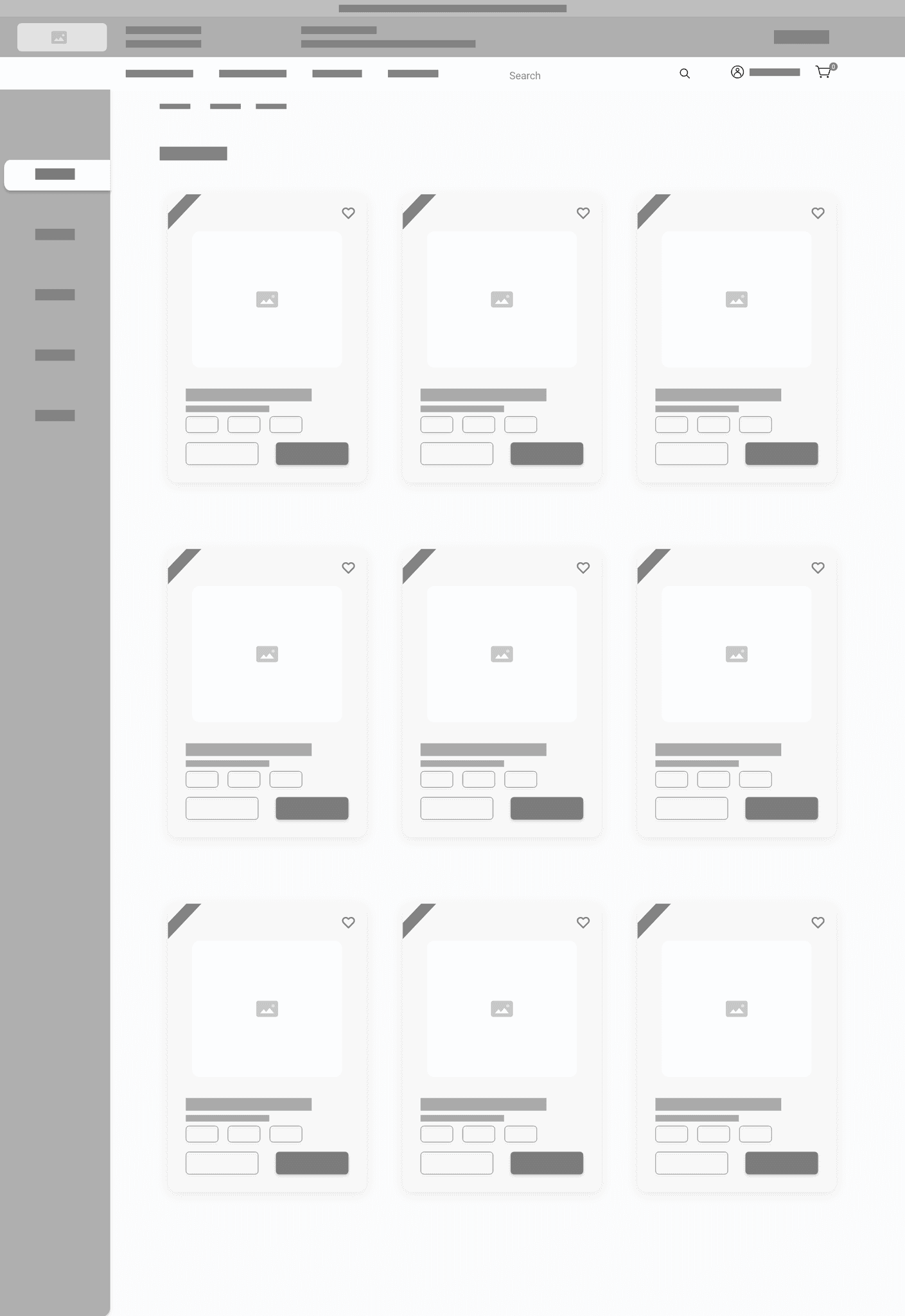

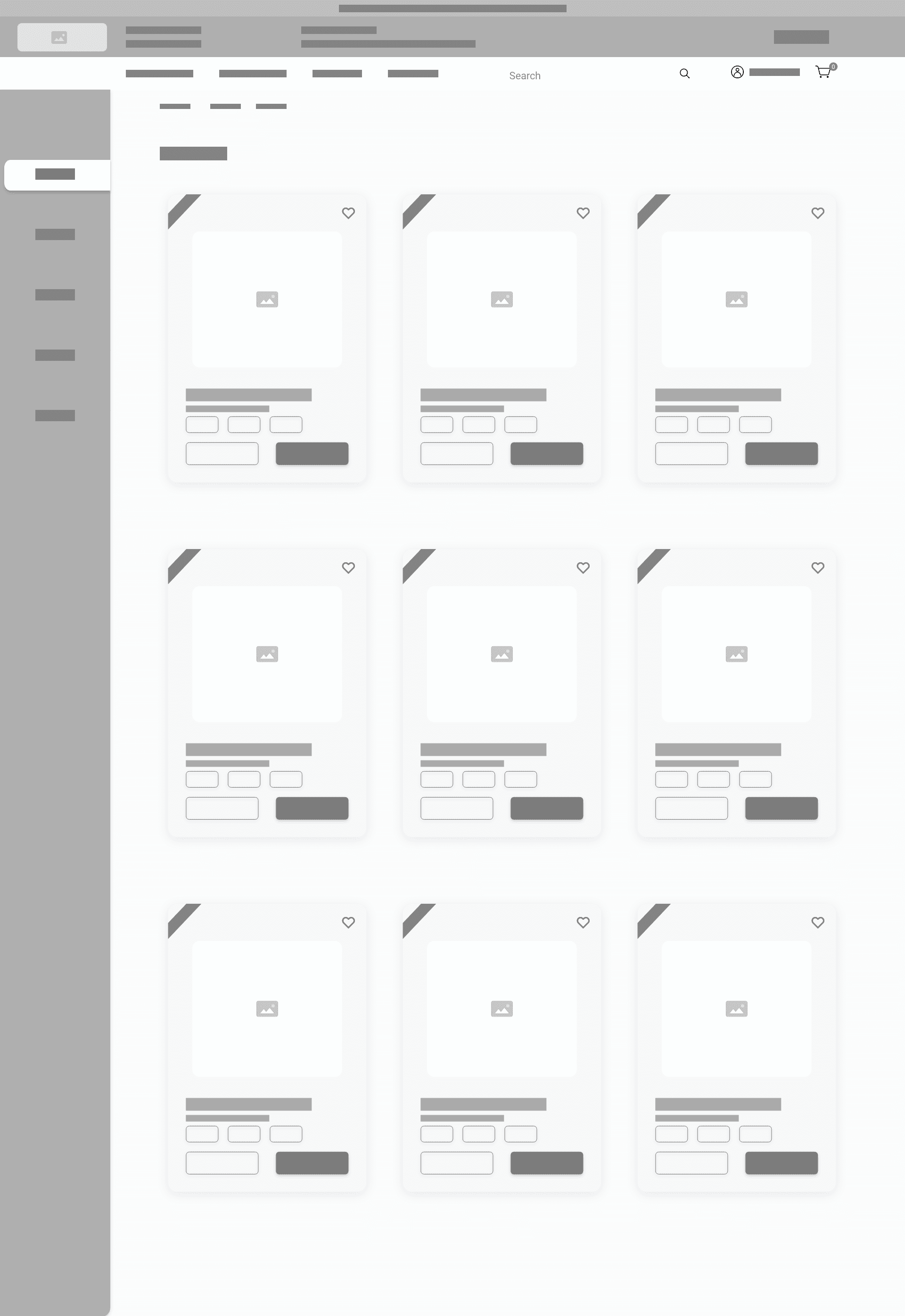


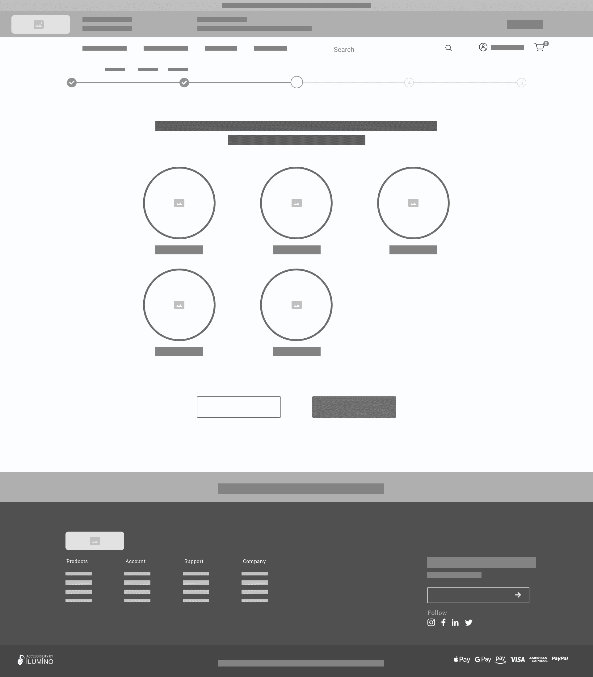

WIREFRAMES
WIREFRAMES
WIREFRAMES
Home Page
Home Page
Product List
Product List
Find My Match Quiz
HI-FI WIREFRAMES
HI-FI WIREFRAMES
HI-FI WIREFRAMES
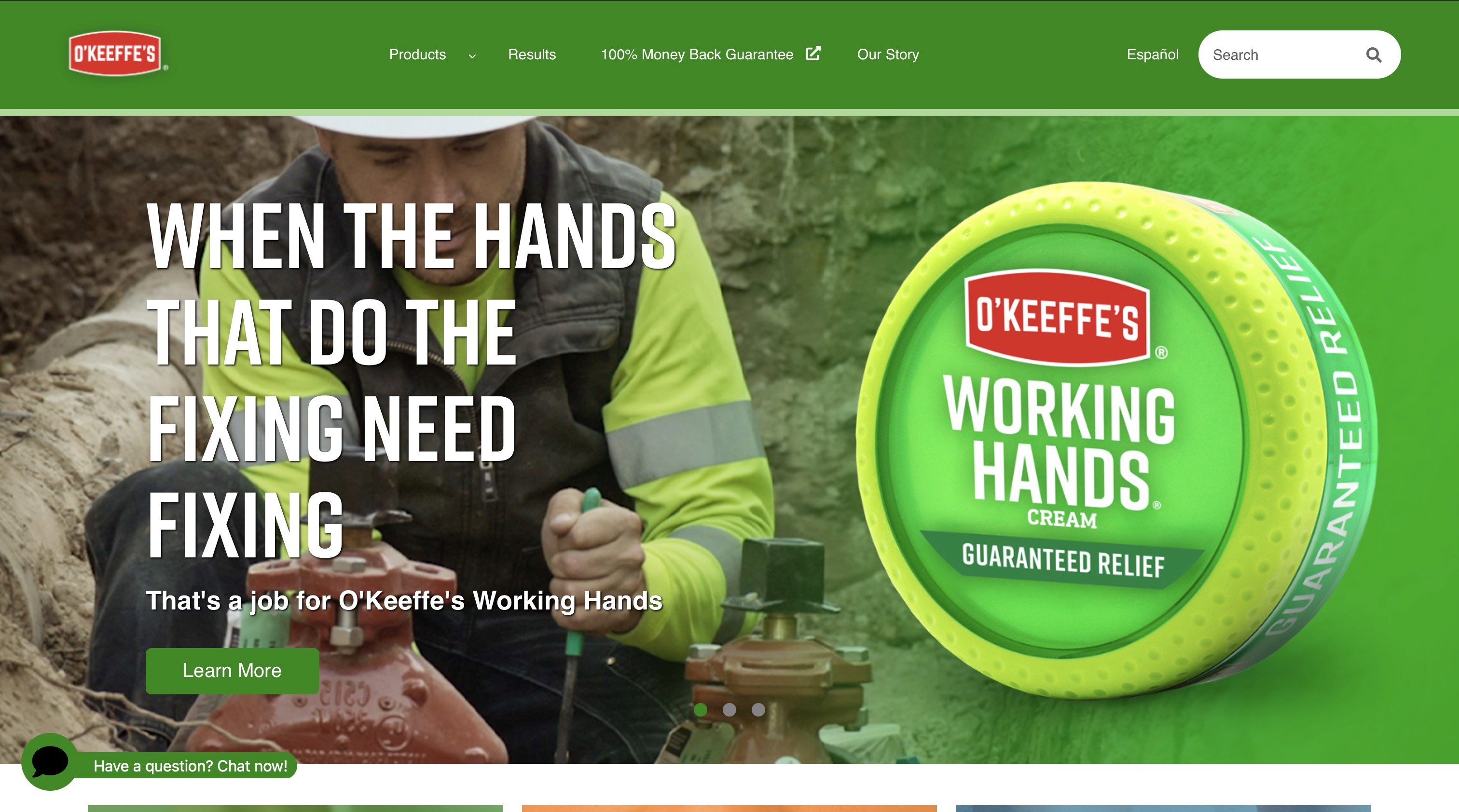
After
After
Before
UP NEXT
UP NEXT
REFRAMING THE PROBLEM
This prompted the question: How can we simplify the shopping experience and keep users on the site? My solution was to integrate an e-commerce platform with a feature called "Find My Match," which offers smart product recommendations based on a brief survey to understand user preferences. This allows customers to explore and buy O'Keeffe's products seamlessly in one place.
" …improve the visibility of O'Keeffe's product offerings for new users to boost online sales? "
